Industry
Wellness
Client
Buyceps
One bar © Branding
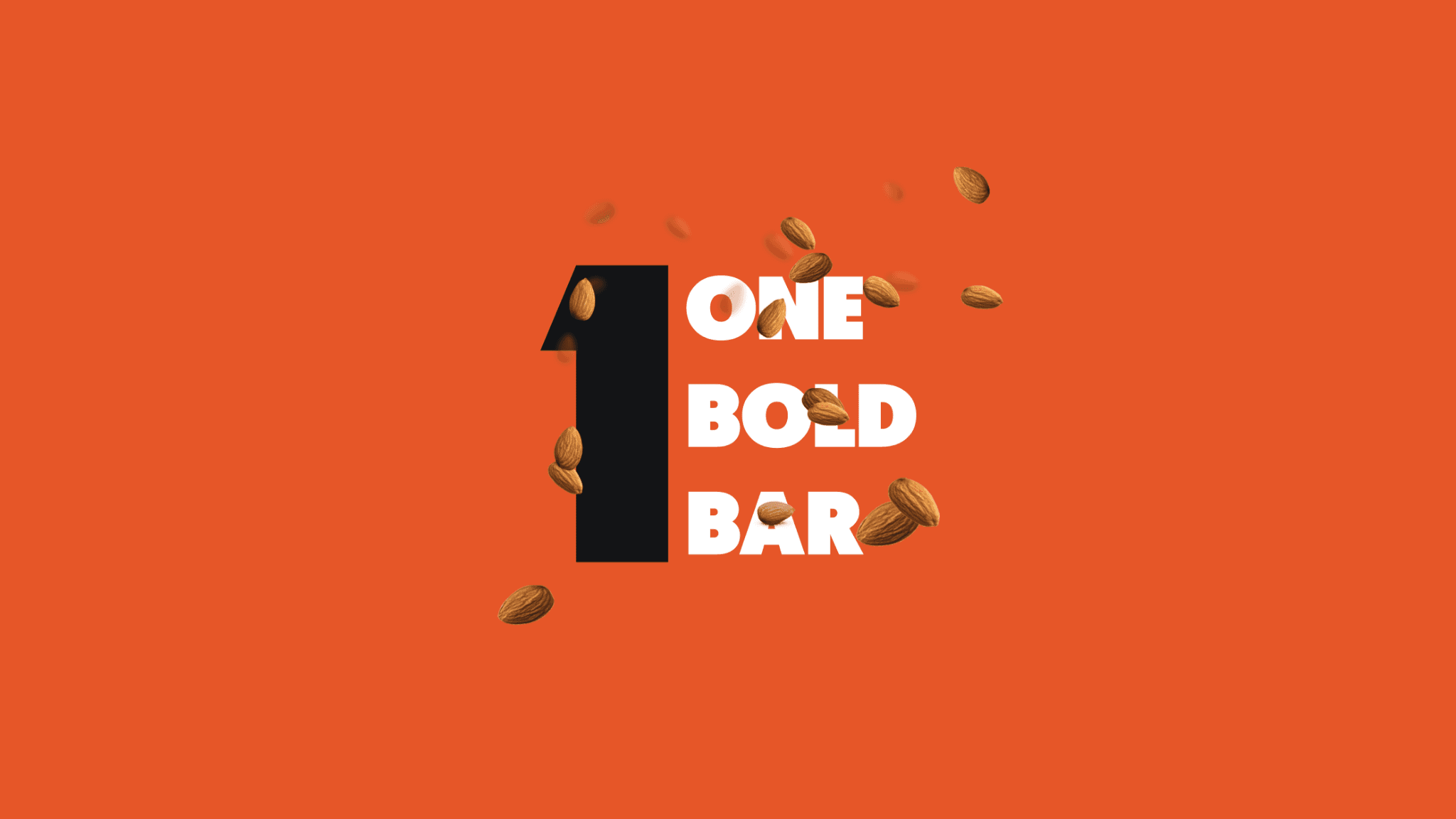
Crafting a Bold Identity: One Bar Branding & Packaging
In a fast-moving startup environment, wearing multiple hats is often the norm. While branding isn’t my primary skill set, I took on the challenge of leading the brand design for One Bar, an in-house protein bar product. The goal was simple yet ambitious: create a strong, modern identity and packaging that stands out in a crowded nutrition market. The vision behind One Bar was to make health simple, approachable, and stylish. This meant going beyond just designing a logo — it required crafting a consistent identity system that communicated trust, energy, and lifestyle alignment. Balancing creativity with business needs, the project became a great opportunity to stretch into new skills and deliver something impactful. Through a mix of bold typography, minimal design elements, and vibrant packaging variations, we were able to create a fresh brand language that not only feels premium but also connects with diverse consumer preferences.


